More Climate Spirals
The new interactive addition to the climate spiral family.
Global-mean temperatures are breaking one record after the other since instrumental observations began. Driven by burning of fossil fuels and deforestation, carbon dioxide concentrations have also soared to unprecedented levels. In fact, today's CO2 concentrations are higher than they have ever been over the last 800 thousand years, the period we have good ice core records for. Based on the successful visualisation spiral by Ed Hawkins, we now put all those elements together.
Free Powerpoint slides with the climate spirals available now. Download here. Download all GIFs and MP4 on Dropbox here.
Our new spirals - from emissions to temperatures: The main point is that the temperatures do not spiral out of control, even though that is what it looks like. We control those temperatures. The more fossil fuels we burn, the warmer it is going to get. Thus, we used the graphical language of the spirals to show that cause-effect chain from emissions to concentrations to temperatures. If we want to keep warming below a certain temperature level, like 1.5C or 2C, we need to keep the cumulative CO2 emissions in check. And yet, with ever bigger steps, we race towards trashing those carbon budget limits. Enjoy our version of the climate spirals. Useful for lectures and in school classes. Best enjoyed as full-screen (F11) show here:
This web-based visualisation can be adapted to show various elements (click on top left corner menu) and is also accessible via www.pik-potsdam.de/primap-live/ or climatecollege.unimelb.edu.au/spiral. Tip: For presentations, it is nicest to use the above web-based version, then press F11 for your full screen mode.
Climate spirals so far
A couple of months ago, Ed Hawkins came up with a hugely successful way of showing monthly global mean temperatures (see here http://www.climate-lab-book.ac.uk/2016/spiralling-global-temperatures/). Extensions to this original spiral have been made by future temperatures under a high-emission scenario projection (RCP8.5) (https://www.usgs.gov/media/images/simulated-global-temperature-change-0). Other timeseries plotted in the same fashion include Artic sea ice and now also historical CO2 concentrations from Mauna Loa, i.e. the so-called Keeling curve since 1950 (http://www.climate-lab-book.ac.uk/spirals/). We thought we provide an addition to that.
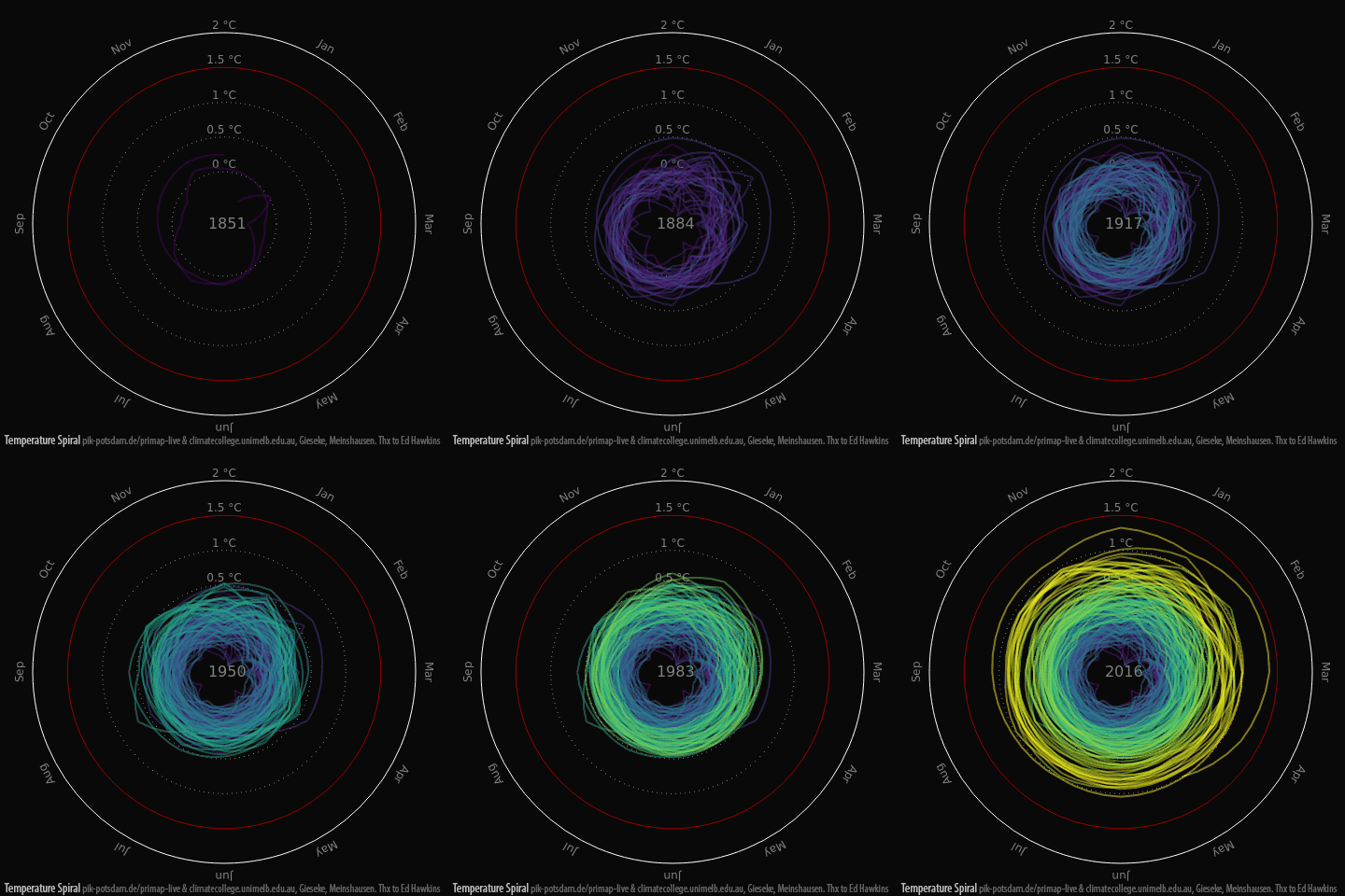
The Temperature Spiral
GIF1 - Global-mean temperatures since 1850. Redrawing the original spirals by Ed Hawkins.
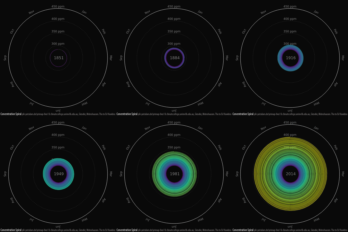
The new full-length Concentration Spiral
GIF2 - Global-mean CO2 concentrations since 1850. This spiral has been made possible thanks to our recent community effort to pull together new long-term timeseries of GHG concentrations, see submitted paper and data here: climatecollege.unimelb.edu.au/cmip6
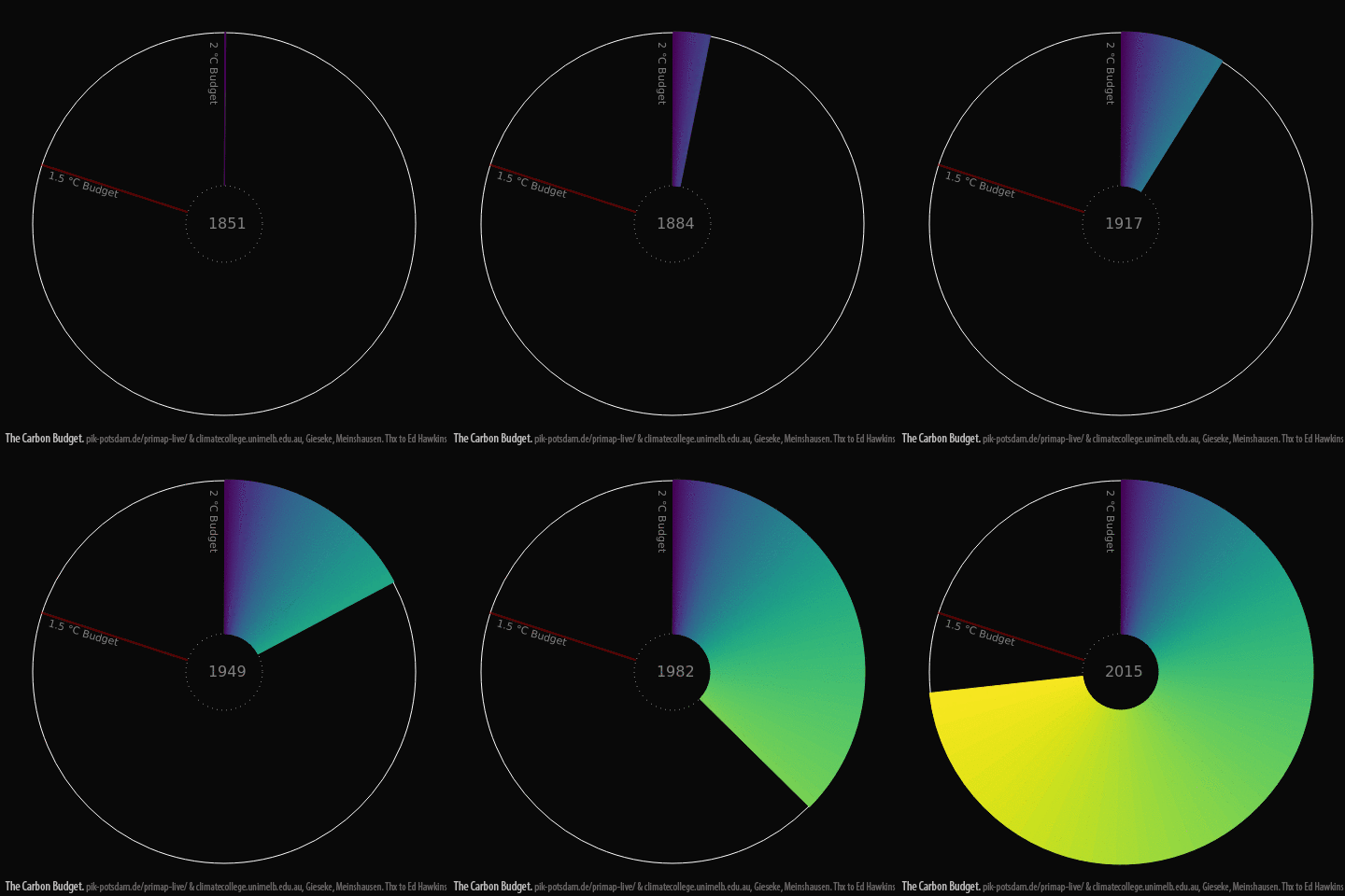
The new Carbon Budget Spiral
GIF3 - The use of the global carbon budget. Main underlying datasource is the new PRIMAP composite source, available here: www.pik-potsdam.de/primap-live/primap-hist/
Movies for offline use
From our interactive web-based application, we extracted a number of mp4 movies for your offline use (or as backup for presentations).
The 3 Climate Spirals
MP4 Movie 1 - The three climate spirals
MP4 Movie 2 - The three climate spirals with line graphs
MP4 Movie 3 - The temperature spiral
MP4 Movie 4 - The temperature spiral with a line graph
MP4 Movie 5 - The CO2 concentration spiral
MP4 Movie 6 - The CO2 concentration spiral with a line graph
MP4 Movie 7 - The carbon budget spiral
MP4 Movie 8 - The carbon budget spiral with line graph
MP4 Movie 9 - The carbon budget spiral with temperature spiral.
Data and Credits: Big credit goes of course to Ed Hawkins for coming up with this tremendously successfull way of visualising the monthly timeseries data. Our graphic magician is Robert Gieseke at our collaborating group at the Potsdam Institute for Climate Impact Research (who is behind a whole series of fascinating web animations on INDCs, Paris Agreement etc. - https://www.pik-potsdam.de/primap-live). The underlying data of emissions was also sourced form our friends at the PIK, namely the PRIMAP-hist database (https://www.pik-potsdam.de/primap-live/primap-hist/) and others like CDIAC (http://cdiac.ornl.gov/trends/emis/meth_reg.html). For the historical CO2 concentrations, we used our newly compiled dataset of global and hemispheric averages, which we just submitted for publication and as input for the next series of climate model runs under CMIP6 (see http://climatecollege.unimelb.edu.au/cmip6). Big thanks also to Alexei Trundle, who mastered twitter and created the offline movies. Please use all our climate spirals freely. If you want, cite them as "Gieseke and Meinshausen (2016) Climate Spirals from emissions to temperatures, available at: www.pik-potsdam.de/primap-live/ or climatecollege.unimelb.edu.au/climate-spirals)"
| Attachment | Size |
|---|---|
| 6.91 MB |


